Button Widget
Button Widget lets you render input as clickable buttons, enabling users to make selections directly in your workflow.
Component description
How the Button Widget component works
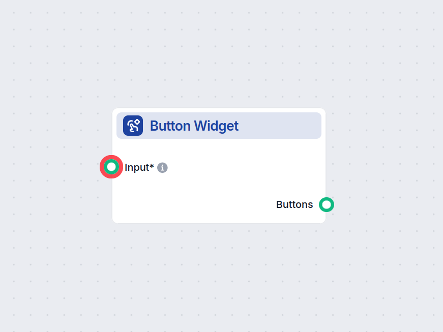
The Button Widget is a flow component designed to render text as a clickable button within your AI workflow interface. This component enables user interactions by allowing input or action selection via buttons, making it valuable for building engaging and interactive AI-driven applications, such as chatbots, guided workflows, or decision trees.
What the Component Does
At its core, the Button Widget takes input text and displays it as a clickable button. Optionally, you can provide a title message above the button(s), which supports Markdown formatting for richer presentation. When a user clicks the button, it triggers the output, which can be used to drive subsequent steps or logic in your workflow.
Inputs
| Name | Type | Required | Description | Advanced | Default Value |
|---|---|---|---|---|---|
| Input | Message | Yes | The input to optionally use as the button’s text. | No | (empty) |
| Button Text | String | No | The text displayed on the button. If not set, it uses the input value. | No | {input} |
| Title Message | String | No | An optional message (supports Markdown) shown above the button(s). | Yes | (empty) |
- Input: Main content, can accept messages which may be rendered as button labels.
- Button Text: Custom label for the button; if omitted, defaults to the value of Input.
- Title Message: Optional text displayed at the top of the button list, with Markdown support for formatting.
Outputs
| Name | Type | Description |
|---|---|---|
| Buttons | Message | Output emitted when a button is clicked. |
The component outputs a Message when a user interacts with the rendered button, which can be used to trigger further actions or pass data to the next component in your workflow.
Use Cases and Benefits
- User Interaction: Easily add interactive elements to your AI workflows, allowing users to make selections or confirm actions.
- Guided Experiences: Build step-by-step guided flows, surveys, or menu systems where users navigate by clicking buttons.
- Dynamic Responses: Customize button labels and display messages dynamically based on previous workflow steps.
Summary
The Button Widget component is a versatile tool for introducing interactivity into your AI workflows. With customizable labels and optional Markdown-formatted titles, it helps you create user-friendly interfaces that can collect input, drive branching logic, or enhance user engagement in AI-powered applications.
Examples of flow templates using Button Widget component
To help you get started quickly, we have prepared several example flow templates that demonstrate how to use the Button Widget component effectively. These templates showcase different use cases and best practices, making it easier for you to understand and implement the component in your own projects.

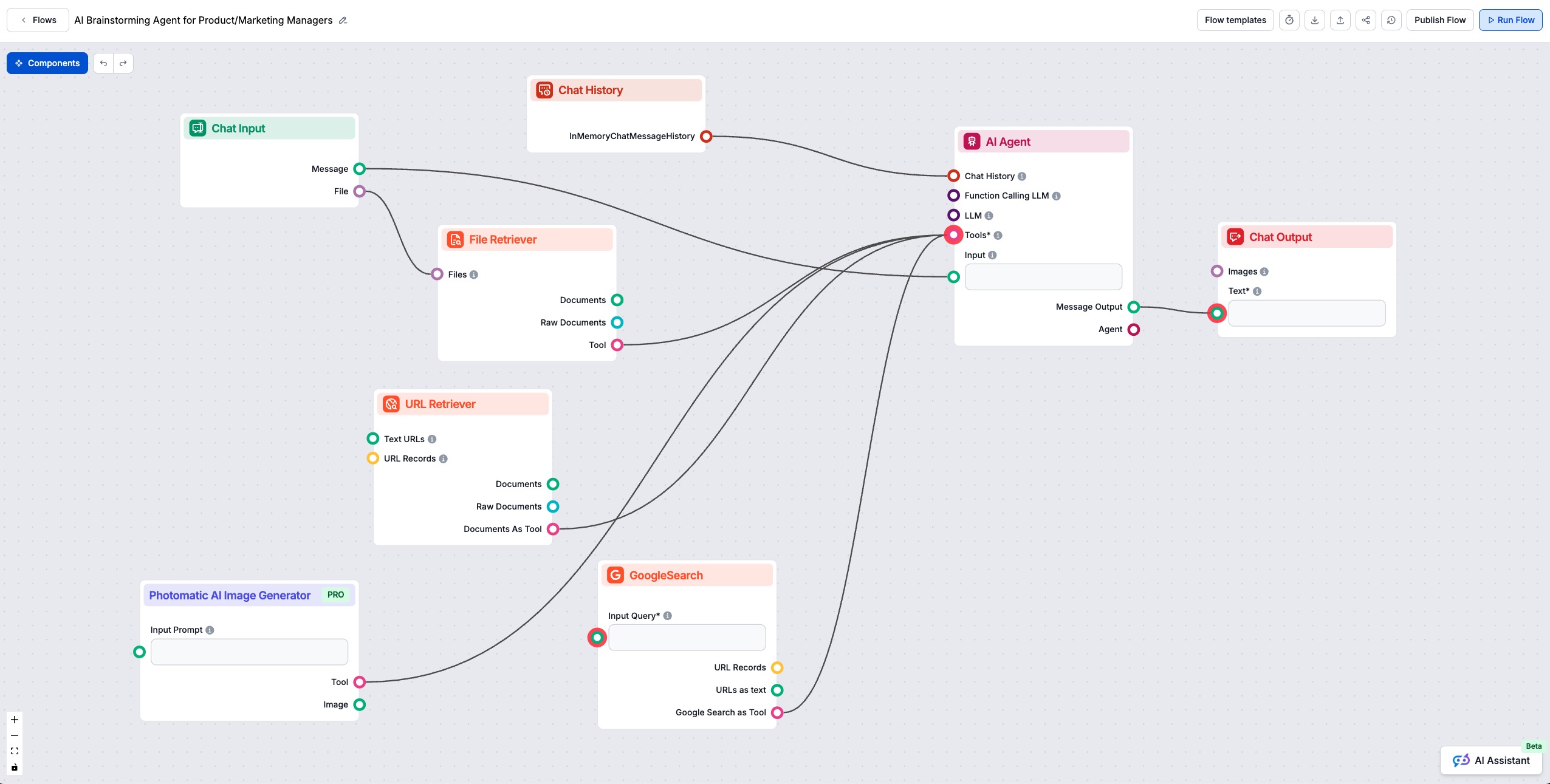
AI Brainstorming & Value Proposition Generator
This AI-powered workflow helps product managers and marketers instantly brainstorm innovative ideas and uncover value propositions. Users can input their contex...
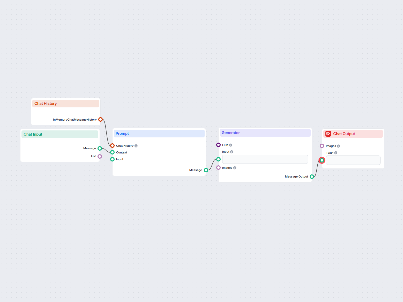
AI Business Idea Generator
Generate innovative business ideas tailored to user input or selected industries using AI. This interactive flow provides suggestions based on user preferences ...
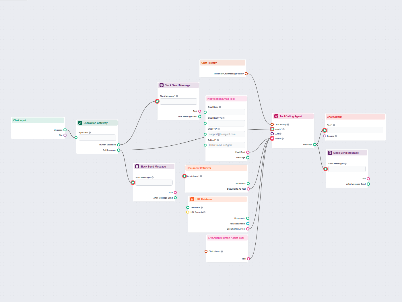
AI Chatbot with Slack Human Escalation
Deploy a smart customer support chatbot for LiveAgent that automatically answers visitor questions, retrieves knowledge base documents, and escalates to a human...
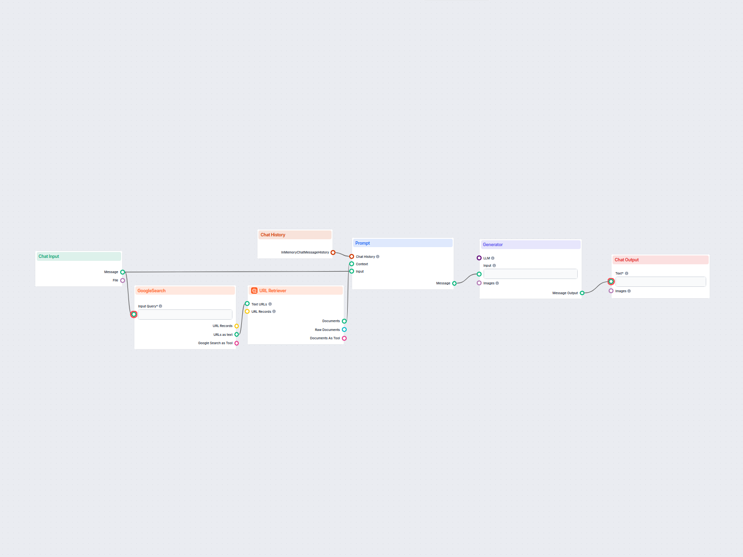
AI Content Idea Generator
Generate unique content ideas and summaries using AI by researching top Google results for any keyword. Ideal for content marketers and creators to quickly disc...
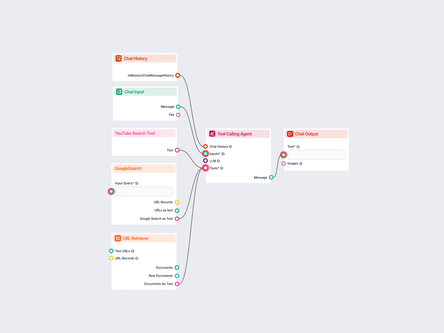
AI Daily News Article Generator
Automatically generates up-to-date news articles on any chosen topic by searching the latest trending articles on Google and YouTube, extracting key content, an...
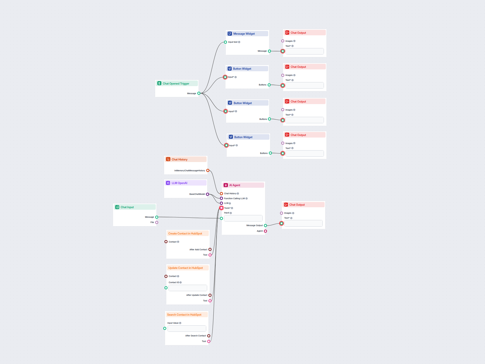
AI HubSpot Contact Manager
This AI-powered workflow automates contact management in HubSpot CRM. Users can easily search, create, or update contacts through a chat interface powered by an...
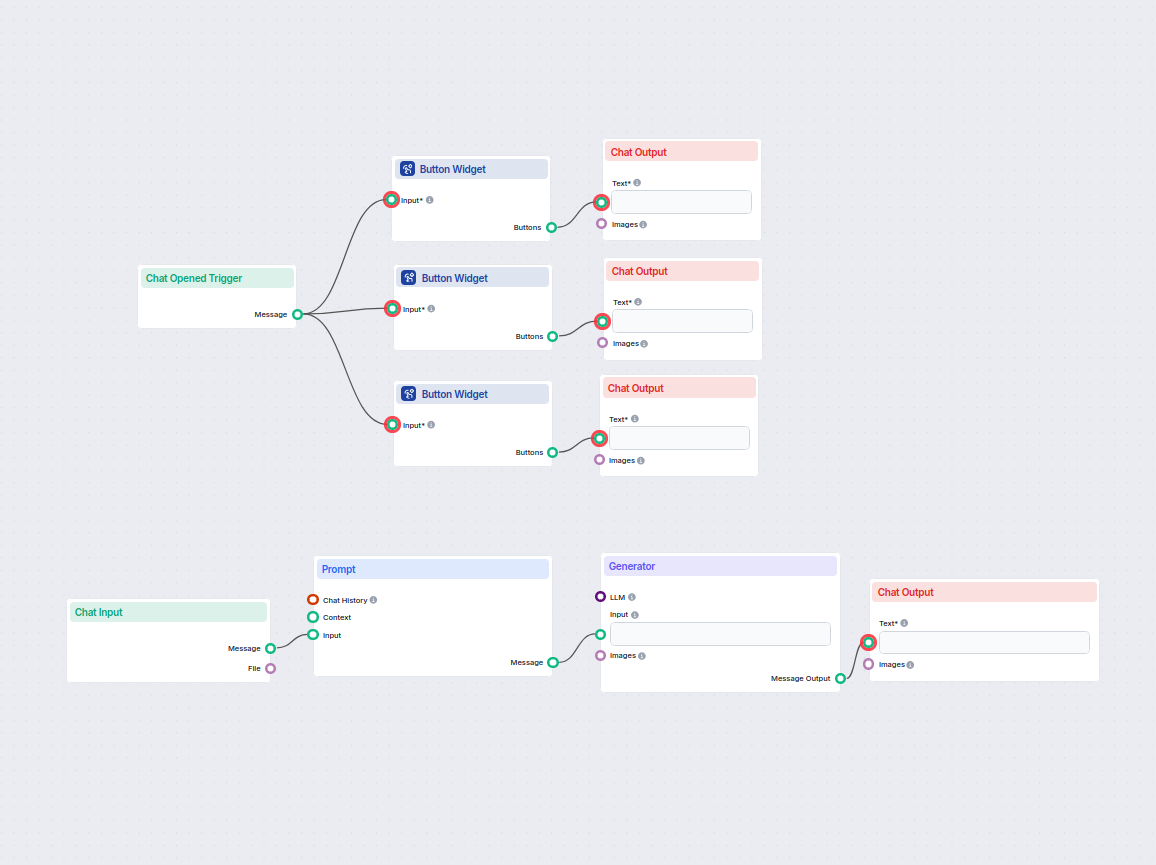
AI Letter Generator
Easily generate formal, informal, or legal letters tailored to your needs. This AI-powered workflow takes your input and creates a personalized letter draft, he...
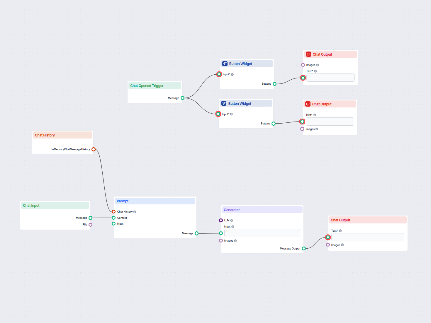
AI Mission Statement Generator
Automatically crafts a tailored mission statement based on user input and chat context. Ideal for startups, entrepreneurs, and marketers seeking to articulate t...
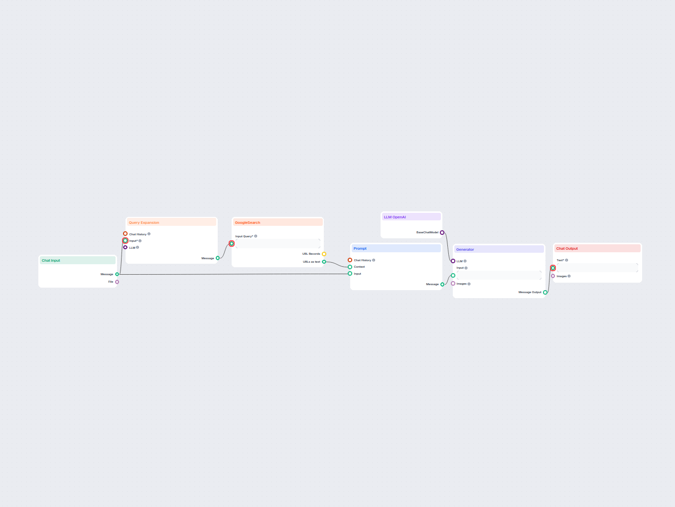
AI Page Title Generator
Generate unique, SEO-optimized web page titles using AI and live Google search data. Enter your target keywords and receive a high-ranking title suggestion tail...
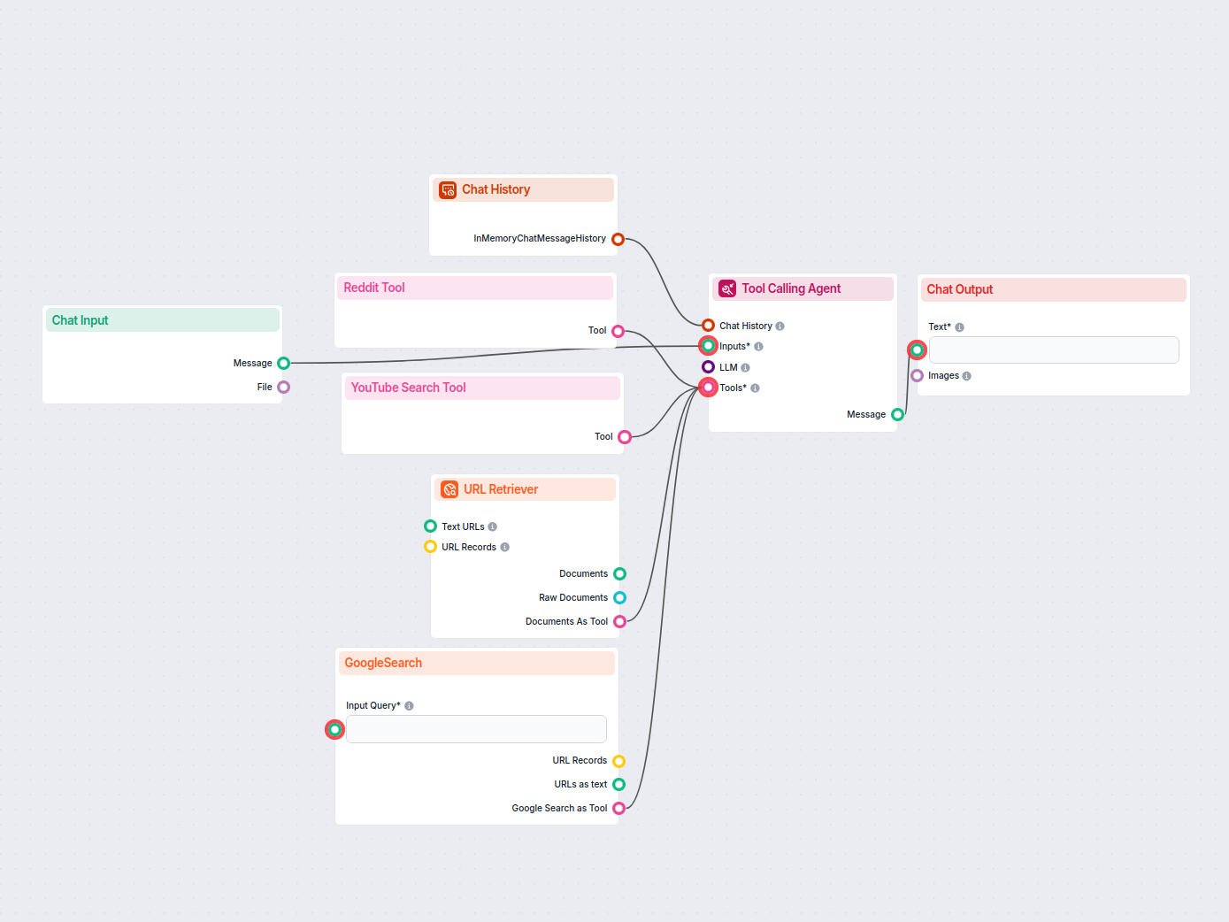
AI Product Description Generator
Create compelling, SEO-optimized product descriptions for e-commerce by gathering key information from Google, Reddit, YouTube, and product URLs with the help o...
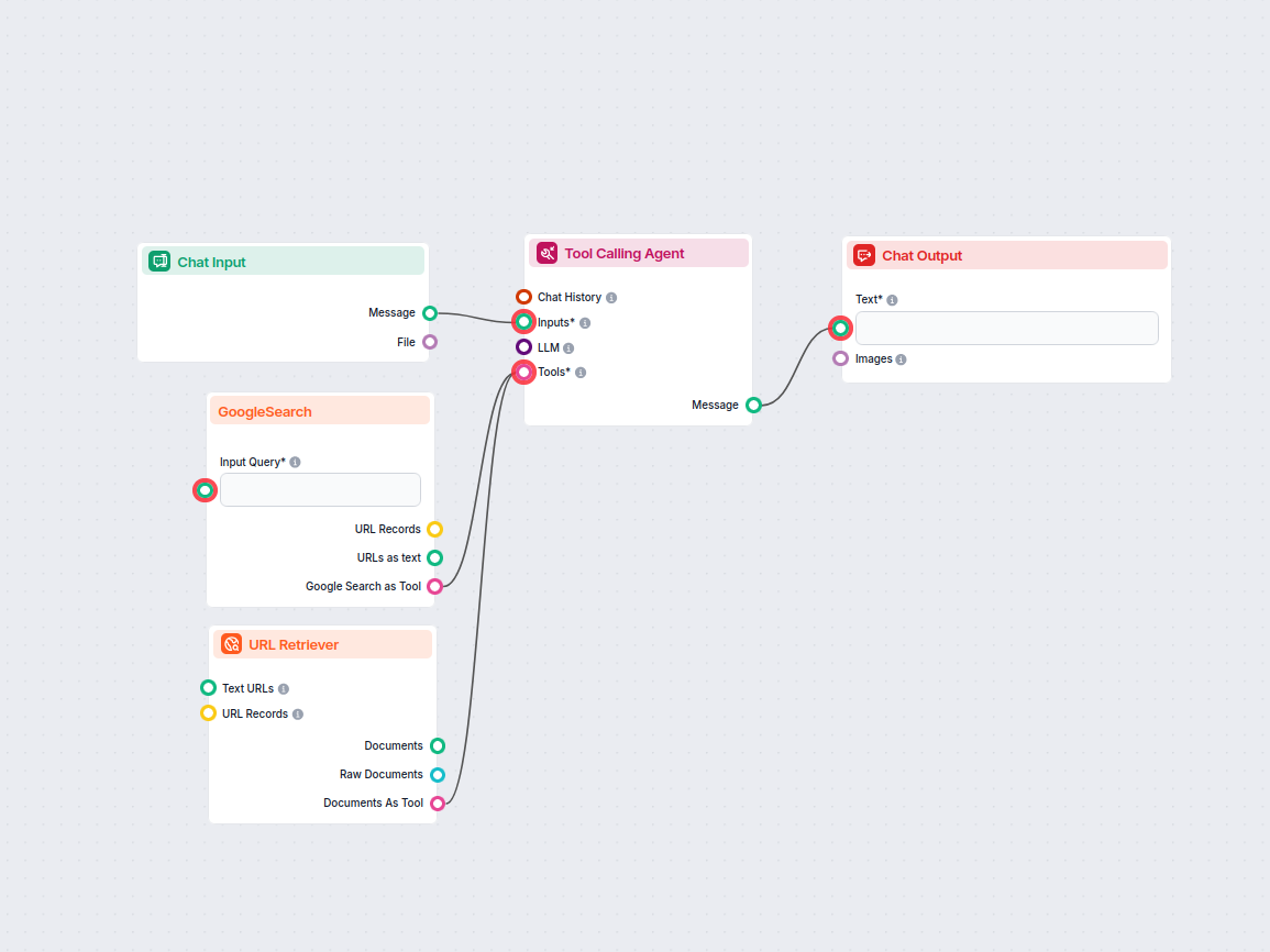
AI Pros and Cons List Generator
Generate a detailed and balanced list of pros and cons for any topic using AI research and live web information. Ideal for content creators, writers, and decisi...
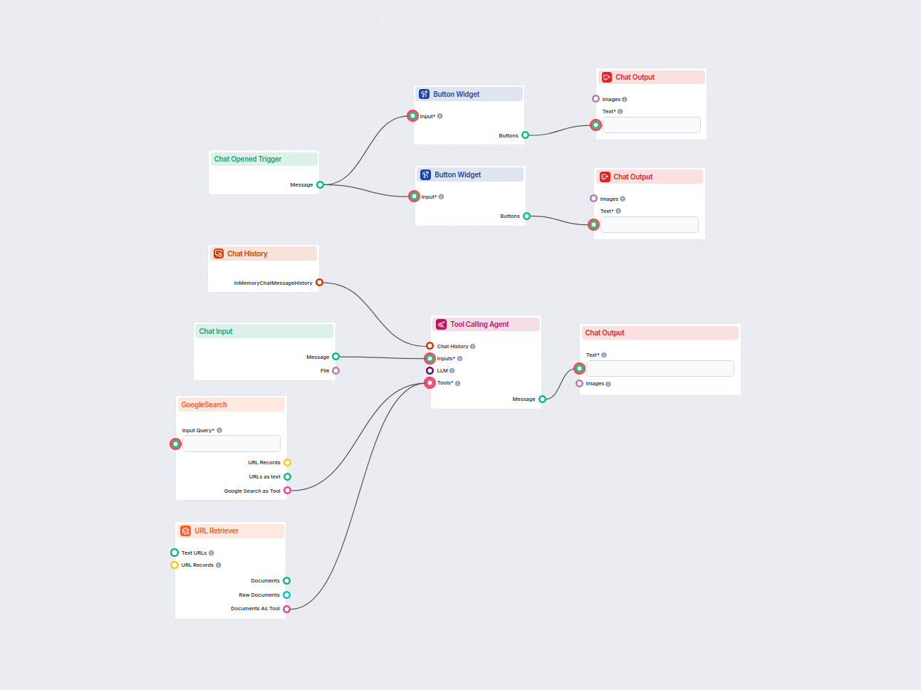
AI-Powered Google Answer Chatbot
An AI chatbot that provides instant, up-to-date answers to any question by searching Google and retrieving relevant website content, always including source lin...
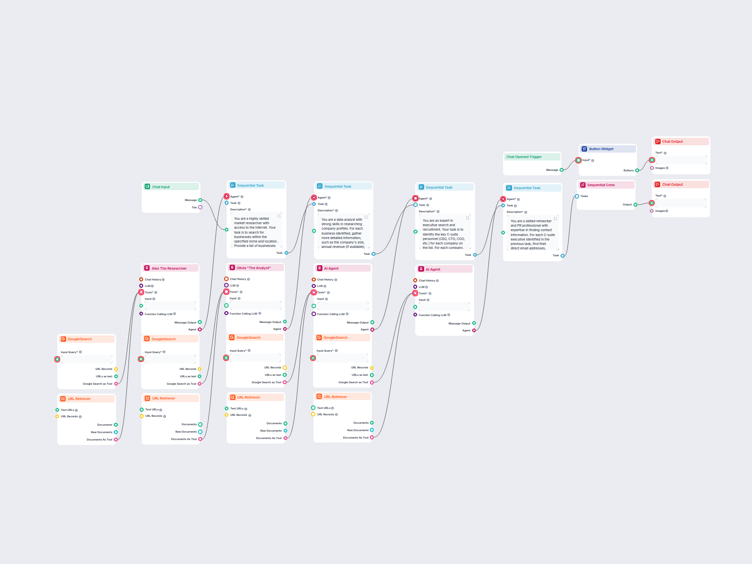
Automated C-Suite Lead Generation
This AI-powered workflow automates outbound lead generation by identifying top businesses in a specific niche and location, then deeply researching company prof...
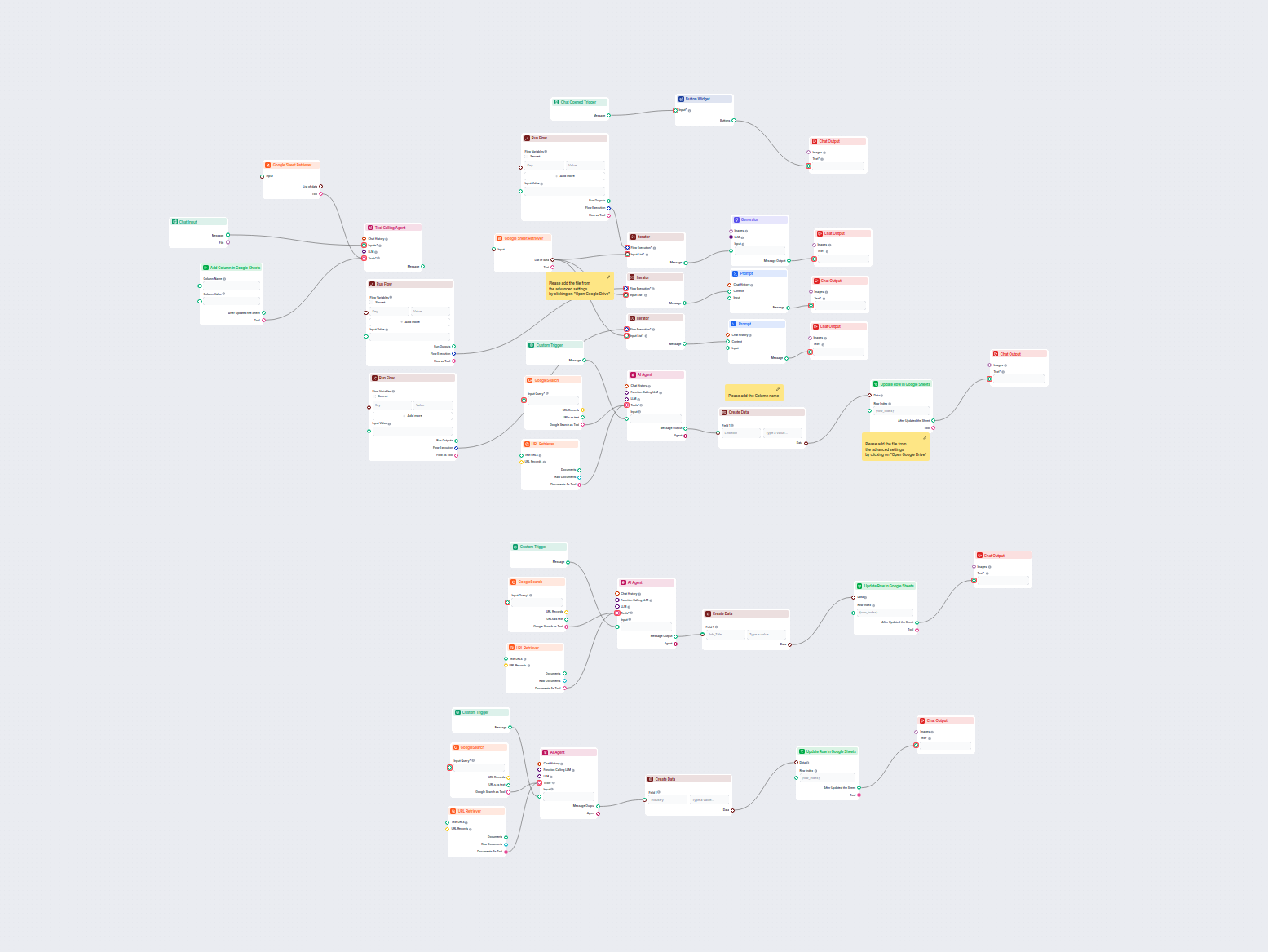
Automated LinkedIn, Job Title & Industry Data Enrichment from Google Sheets
This workflow automatically enriches Google Sheets contact data by finding LinkedIn profiles, extracting job titles and industries, and updating the sheet using...
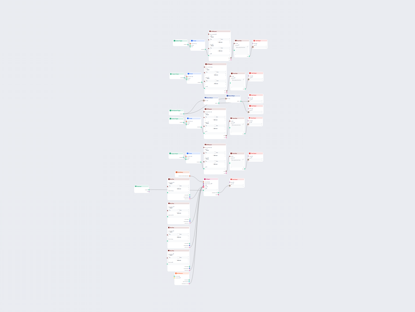
Hacker News Top Stories AI Curator
An automated AI-powered workflow to fetch, summarize, and present the top Hacker News stories, including story details, URLs, and top comments. Users can intera...
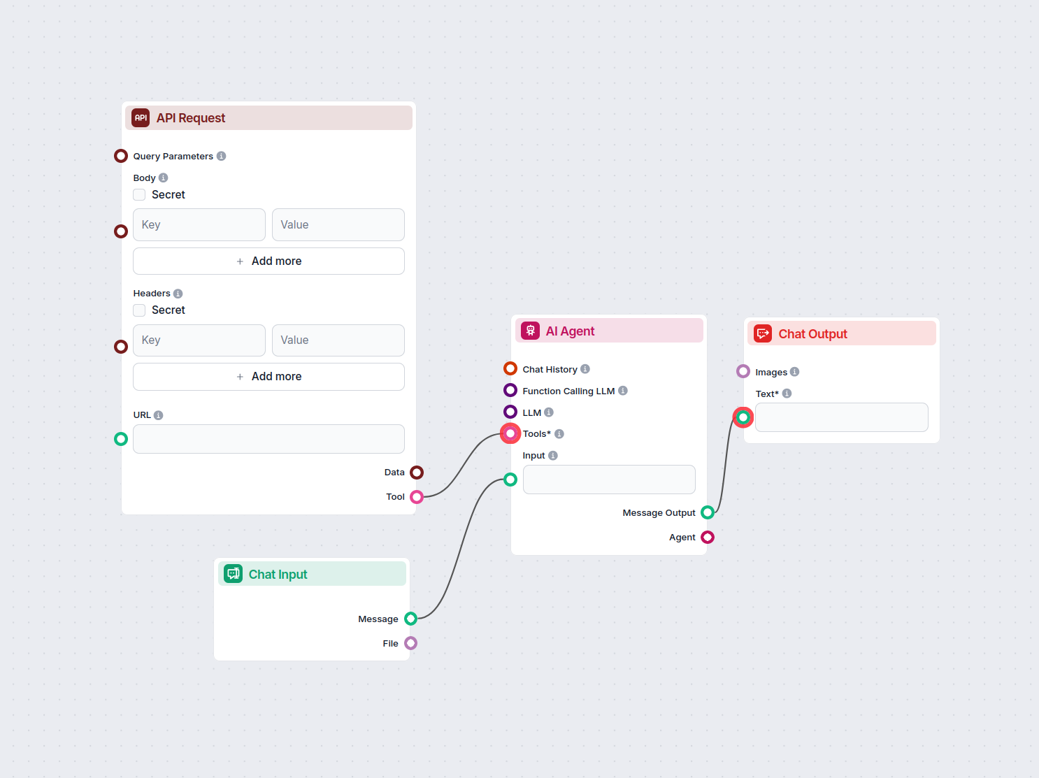
IP Lookup Chatbot with Real-Time Location Details
This AI-powered chatbot instantly provides detailed information about any IP address, including city, country, timezone, and ISP, by leveraging live data from a...
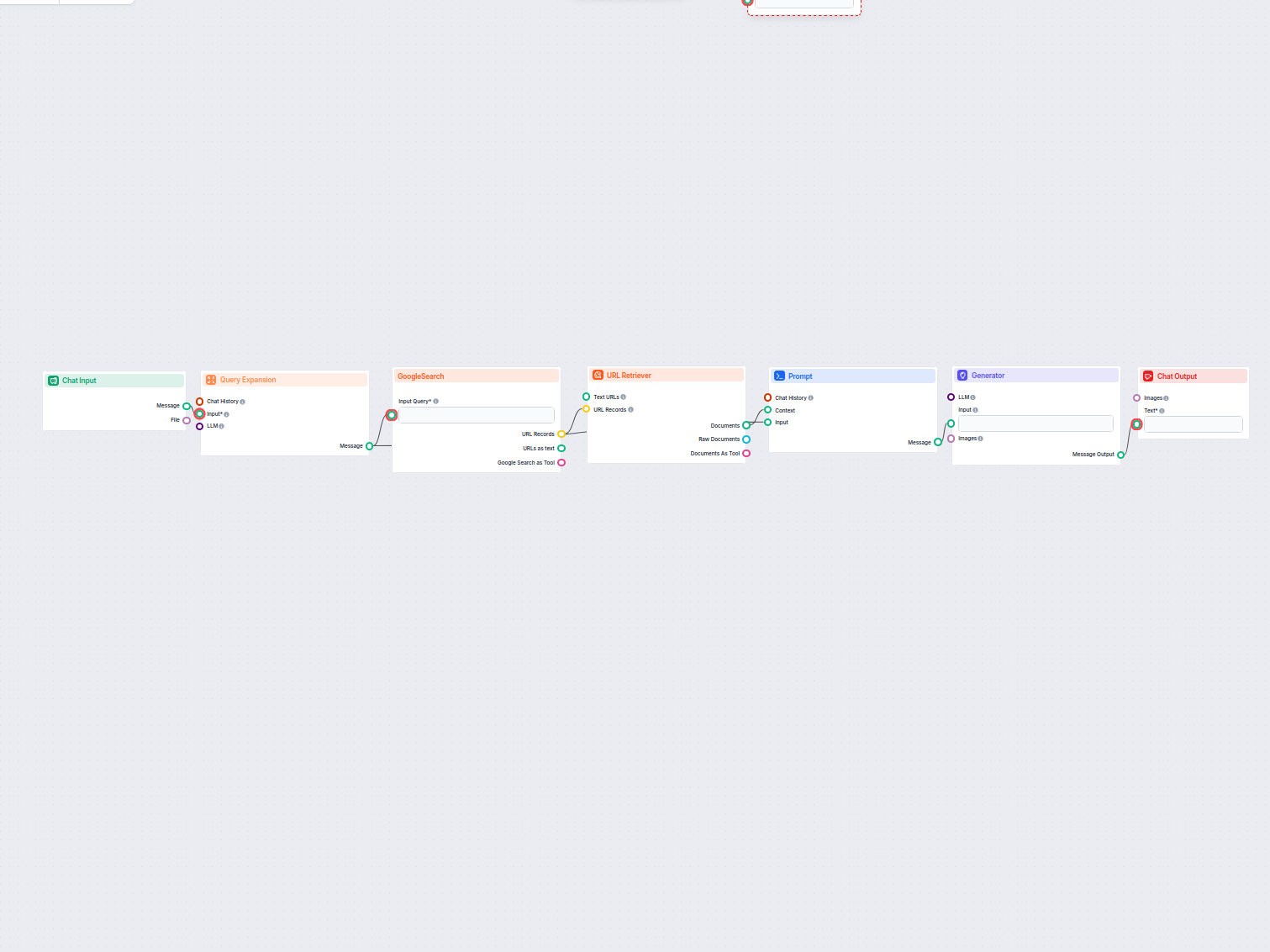
Top Ranking Content Generator
Generate well-structured web page content based on the analysis of top-ranking Google pages for any keyword. This flow automates keyword research, extracts comp...
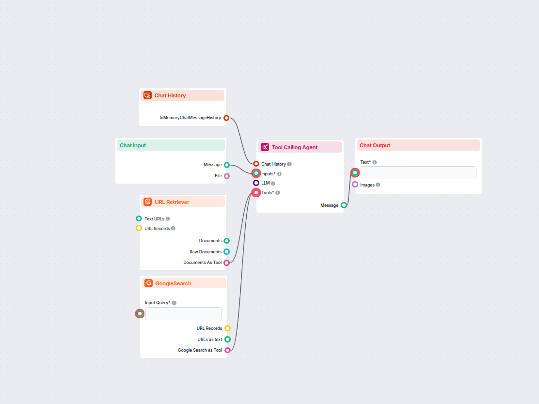
Trending Topics Research Assistant
Discover what people are talking about online around your chosen keyword. This AI-powered workflow researches trending or related topics from recent internet di...
Frequently asked questions
- What does the Button Widget component do?
It displays input text as clickable buttons, allowing users to make selections that drive your flow logic.
- Can I customize the button text?
Yes, you can specify what text appears on each button with the 'Button Text' field, using inputs or static values.
- Is Markdown supported in the title?
Yes, you can format the title message above the buttons using Markdown for better presentation.
- Where can I use the Button Widget?
It's ideal for chatbots, automated workflows, or any scenario where you need users to choose an option or provide input interactively.
- Does the Button Widget support multiple buttons?
Yes, you can render multiple buttons in a list, each representing different options for the user.
Enhance Your Workflow with Button Widget
Add interactive buttons to your flows and build engaging, user-friendly automations with FlowHunt.
Learn more
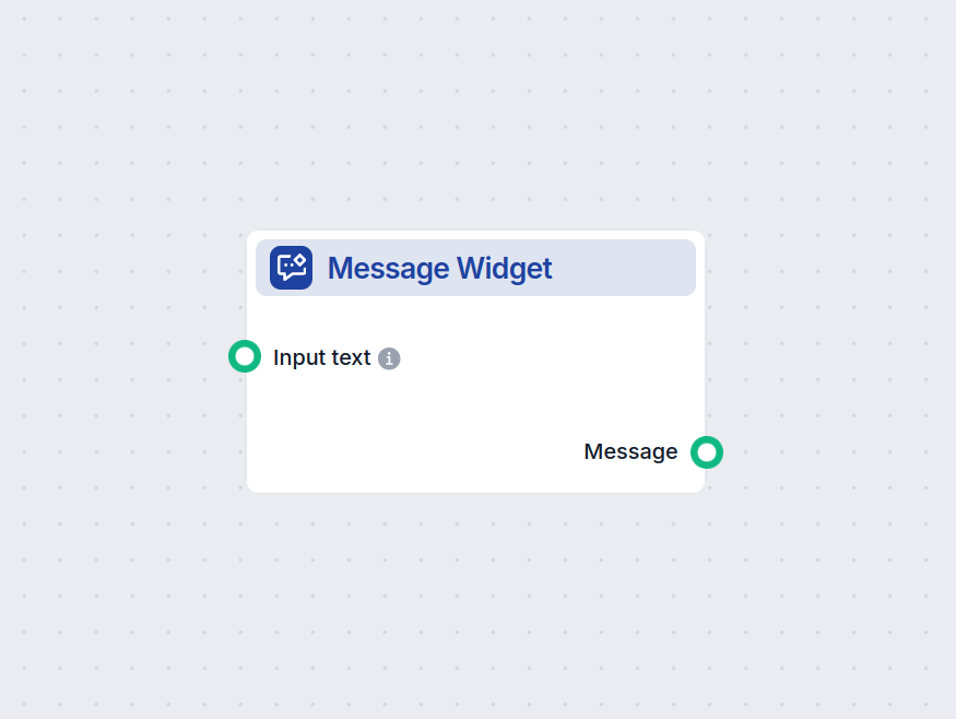
Message Widget
The Message Widget component displays custom messages within your workflow. Ideal for welcoming users, providing instructions, or showing any important informat...
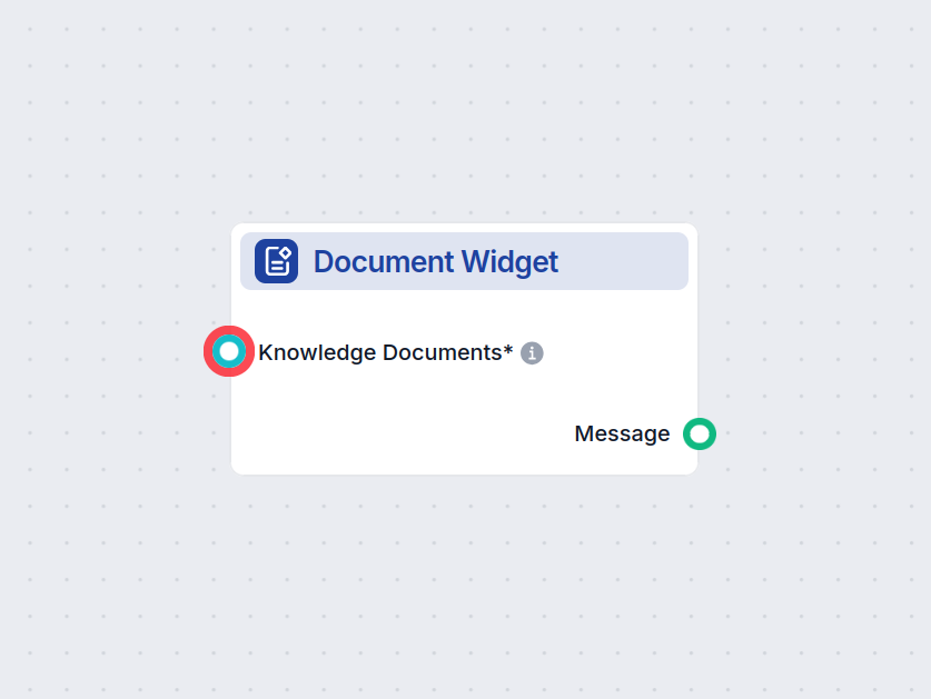
Knowledge Source Widget
Showcase relevant documents directly within your chatbot responses using the Knowledge Source Widget. This component displays selected knowledge documents as vi...
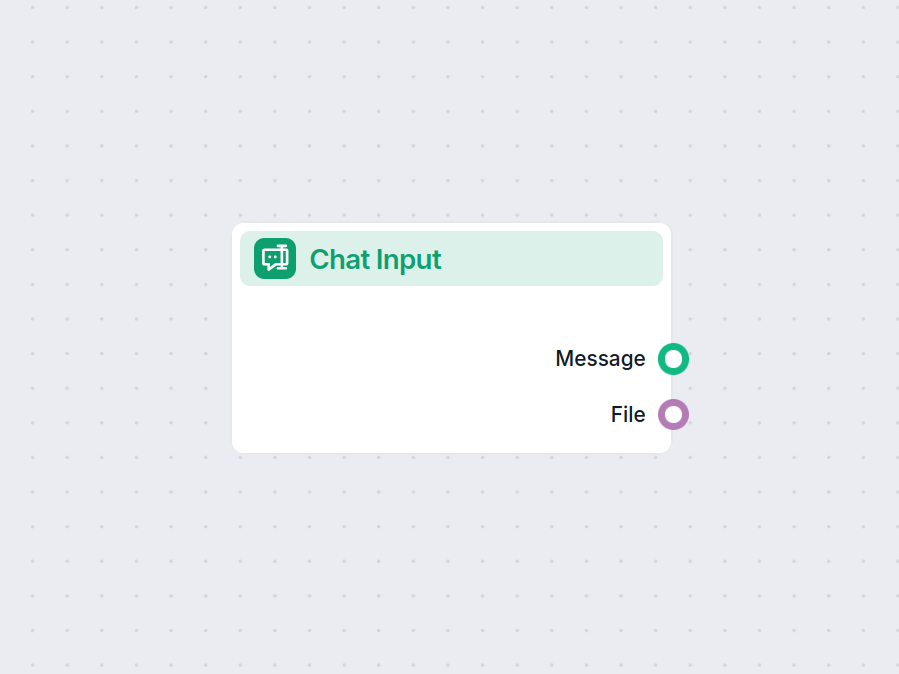
ChatInput
The Chat Input component in FlowHunt initiates user interactions by capturing messages from the Playground. It serves as the starting point for flows, enabling ...

