Descrizione del componente
Come funziona il componente Widget Pulsante
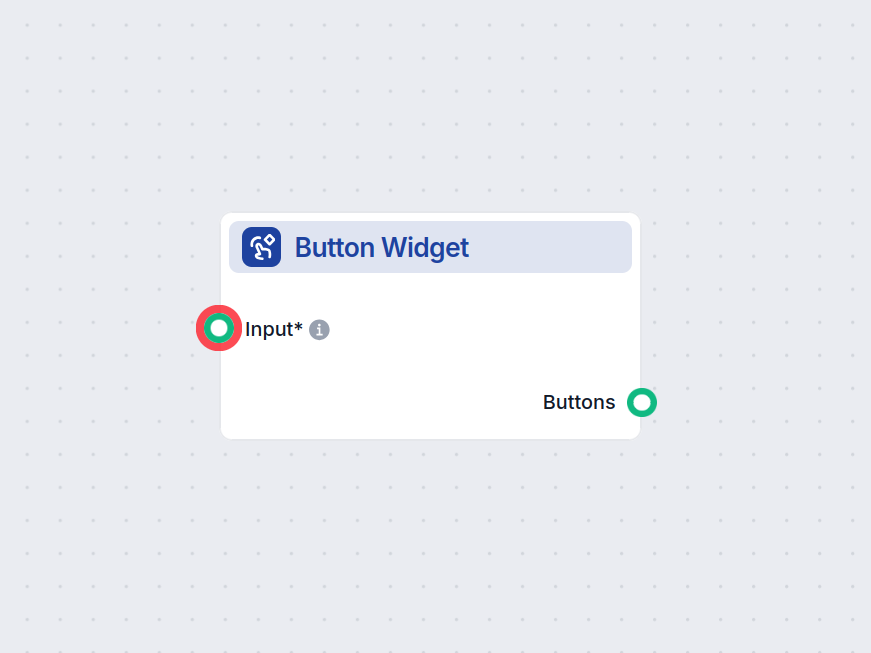
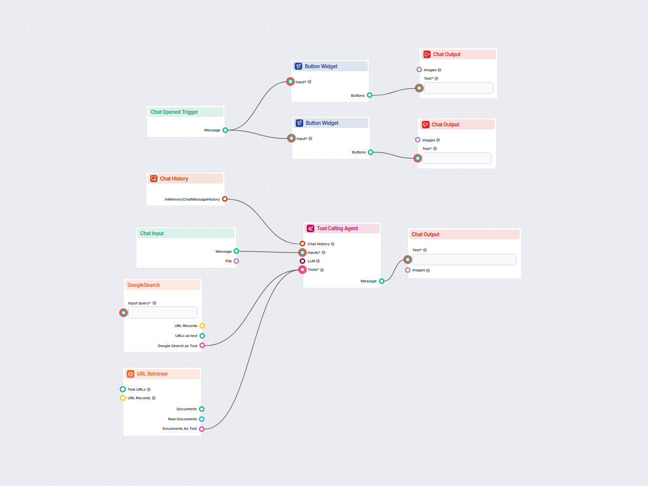
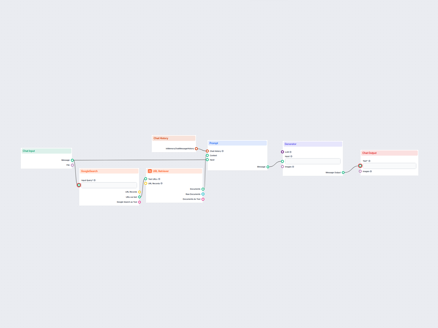
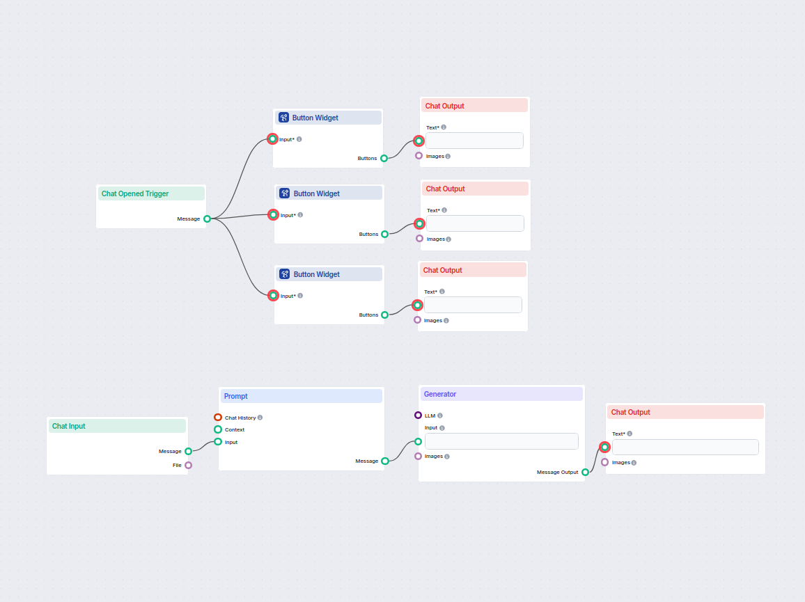
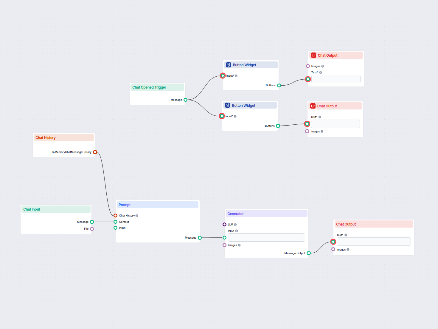
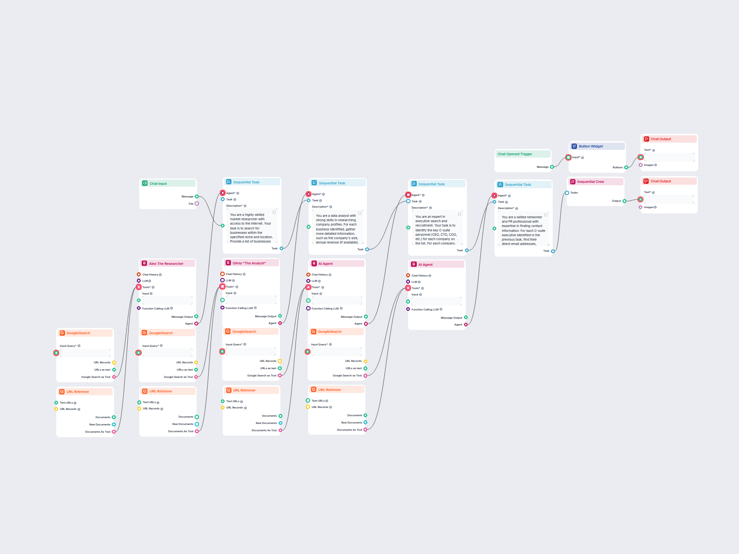
The Button Widget is a flow component designed to render text as a clickable button within your AI workflow interface. This component enables user interactions by allowing input or action selection via buttons, making it valuable for building engaging and interactive AI-driven applications, such as chatbots, guided workflows, or decision trees.
What the Component Does
At its core, the Button Widget takes input text and displays it as a clickable button. Optionally, you can provide a title message above the button(s), which supports Markdown formatting for richer presentation. When a user clicks the button, it triggers the output, which can be used to drive subsequent steps or logic in your workflow.
| Name | Type | Required | Description | Advanced | Default Value |
|---|
| Input | Message | Yes | The input to optionally use as the button’s text. | No | (empty) |
| Button Text | String | No | The text displayed on the button. If not set, it uses the input value. | No | {input} |
| Title Message | String | No | An optional message (supports Markdown) shown above the button(s). | Yes | (empty) |
- Input: Main content, can accept messages which may be rendered as button labels.
- Button Text: Custom label for the button; if omitted, defaults to the value of Input.
- Title Message: Optional text displayed at the top of the button list, with Markdown support for formatting.
Outputs
| Name | Type | Description |
|---|
| Buttons | Message | Output emitted when a button is clicked. |
The component outputs a Message when a user interacts with the rendered button, which can be used to trigger further actions or pass data to the next component in your workflow.
Use Cases and Benefits
- User Interaction: Easily add interactive elements to your AI workflows, allowing users to make selections or confirm actions.
- Guided Experiences: Build step-by-step guided flows, surveys, or menu systems where users navigate by clicking buttons.
- Dynamic Responses: Customize button labels and display messages dynamically based on previous workflow steps.
Summary
The Button Widget component is a versatile tool for introducing interactivity into your AI workflows. With customizable labels and optional Markdown-formatted titles, it helps you create user-friendly interfaces that can collect input, drive branching logic, or enhance user engagement in AI-powered applications.